Turning a licensing warning into a student opportunity
How I designed a progressive messaging journey that paired increasing urgency with free access to genuine Photoshop for eligible students in India
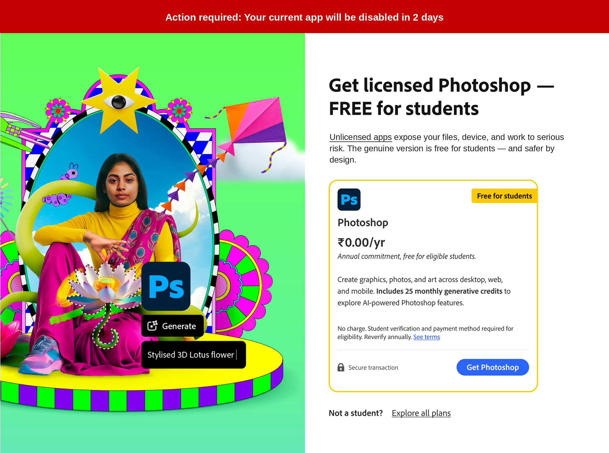
Adobe’s Genuine team helps people using unlicensed software move to legitimate Adobe products. For this India pilot, eligible students were informed that their unlicensed app would be disabled after a five-day countdown—but they were also offered a constructive alternative: licensed Photoshop at no cost, with 25 monthly generative credits.
I led the messaging strategy and UX writing across in-context notifications and out-of-context cards. The challenge was to communicate a firm and time-sensitive consequence without sounding punitive, while making the free student offer clear, credible, and easy to act on.
Role
Manager, UX Content Strategy — Monetization & Growth
My ownership
Messaging strategy and UX writing across the countdown journey, including notification cards, out-of-context cards, offer framing, urgency progression, supporting value messages, and calls to action
Audience
Eligible students in India using unlicensed Adobe software
Offer
Licensed Photoshop at ₹0 per year, including 25 monthly generative credits
Channels and scope
In-context notification cards and out-of-context interruption cards across the five-day countdown and post-disablement experience
Impact at a glance
The creative challenge
Communicate the consequence clearly without allowing enforcement to become the entire story.
The experience needed to tell users that their non-genuine app would stop working. That information could not be softened or hidden.
But urgency alone was unlikely to create the best customer outcome. The journey also needed to:
Explain why moving to genuine software mattered
Show students that the transition did not require an unexpected expense
Establish that the offer was legitimate and specifically designed for them
Provide enough repetition to drive action without delivering the same message every day
Preserve a useful path forward after the app had been disabled
The challenge was not simply to warn users. It was to turn a potentially adversarial moment into a clear, achievable transition.
The messaging strategy
Keep the consequence consistent while changing the reason to act.
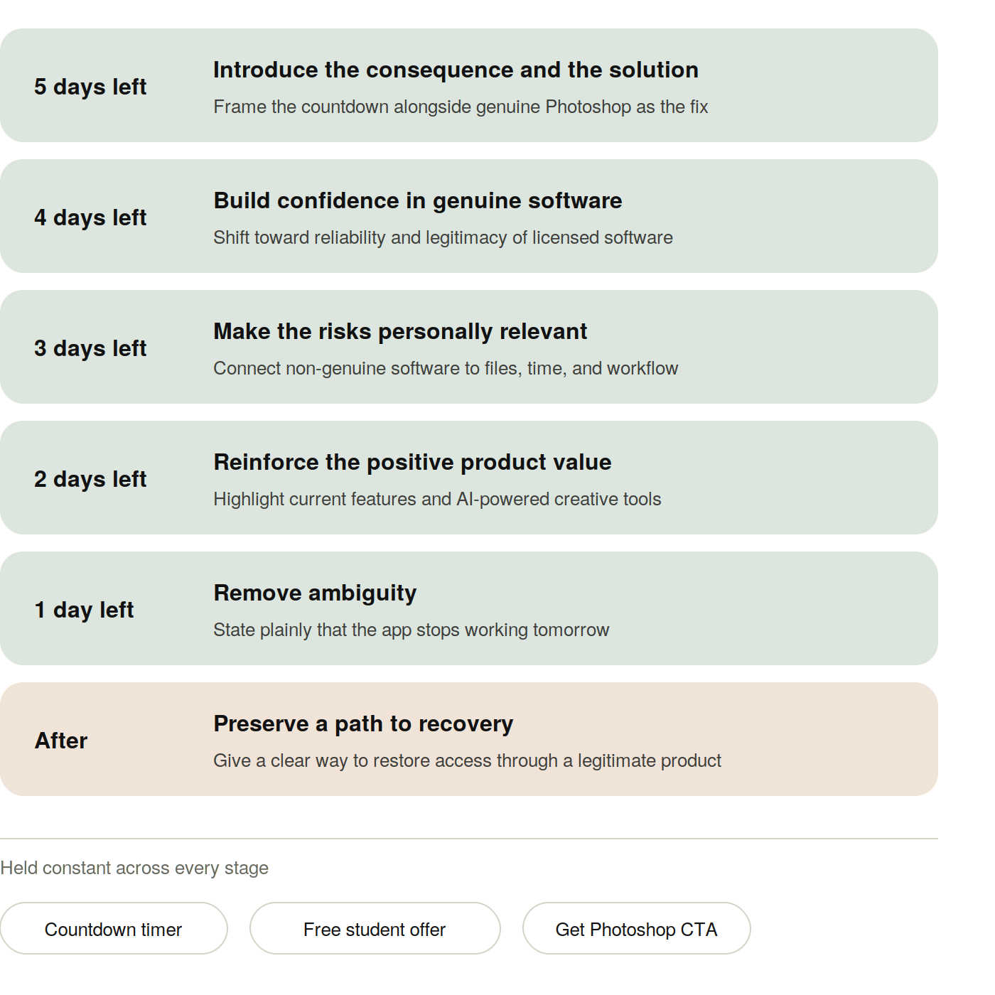
The journey used a stable message architecture across every stage:
Persistent consequence
A prominent countdown made the timing unmistakable.
Consistent offer
Licensed Photoshop remained free for eligible students throughout the journey.
Changing motivation
Each stage introduced a different reason to make the switch.
Stable action
A consistent Get Photoshop call to action reduced decision friction.
Alternative path
People who were not students could still explore other plans.
This structure created recognition and urgency without repeating identical copy across every interaction.
Key content decisions
Six-figure pilot audience
Eligible students in India
Multi-week pilot
Planned initial testing period
The sequencing
Strong four-figure conversion volume
within the five days
A progressive messaging journey paired increasing urgency with a zero-cost student offer, generating strong early conversion.
Campaign outcomes reflect the work of the broader Adobe Genuine team. The messaging strategy, content architecture, and UX writing discussed here reflect my contribution.
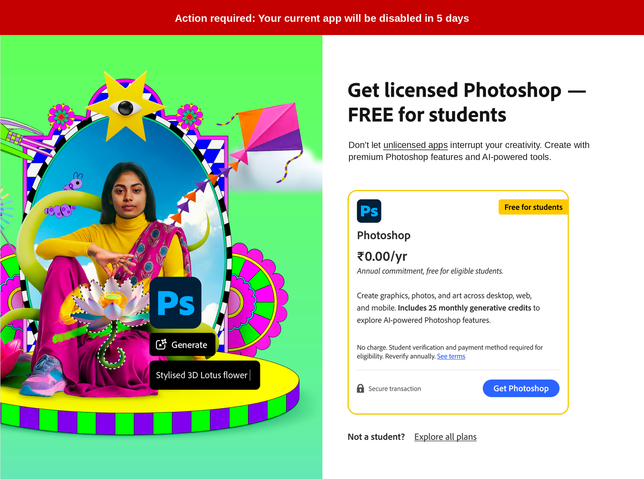
The countdown was prominent, but every warning was paired with a clear solution.
Your current app will stop working.
Get licensed Photoshop—FREE for students.
Rather than presenting disablement as a dead end, the experience gave eligible students an immediate, achievable path to genuine software.
3. Make the final deadline unmistakable
4. Work transparently within localization constraints
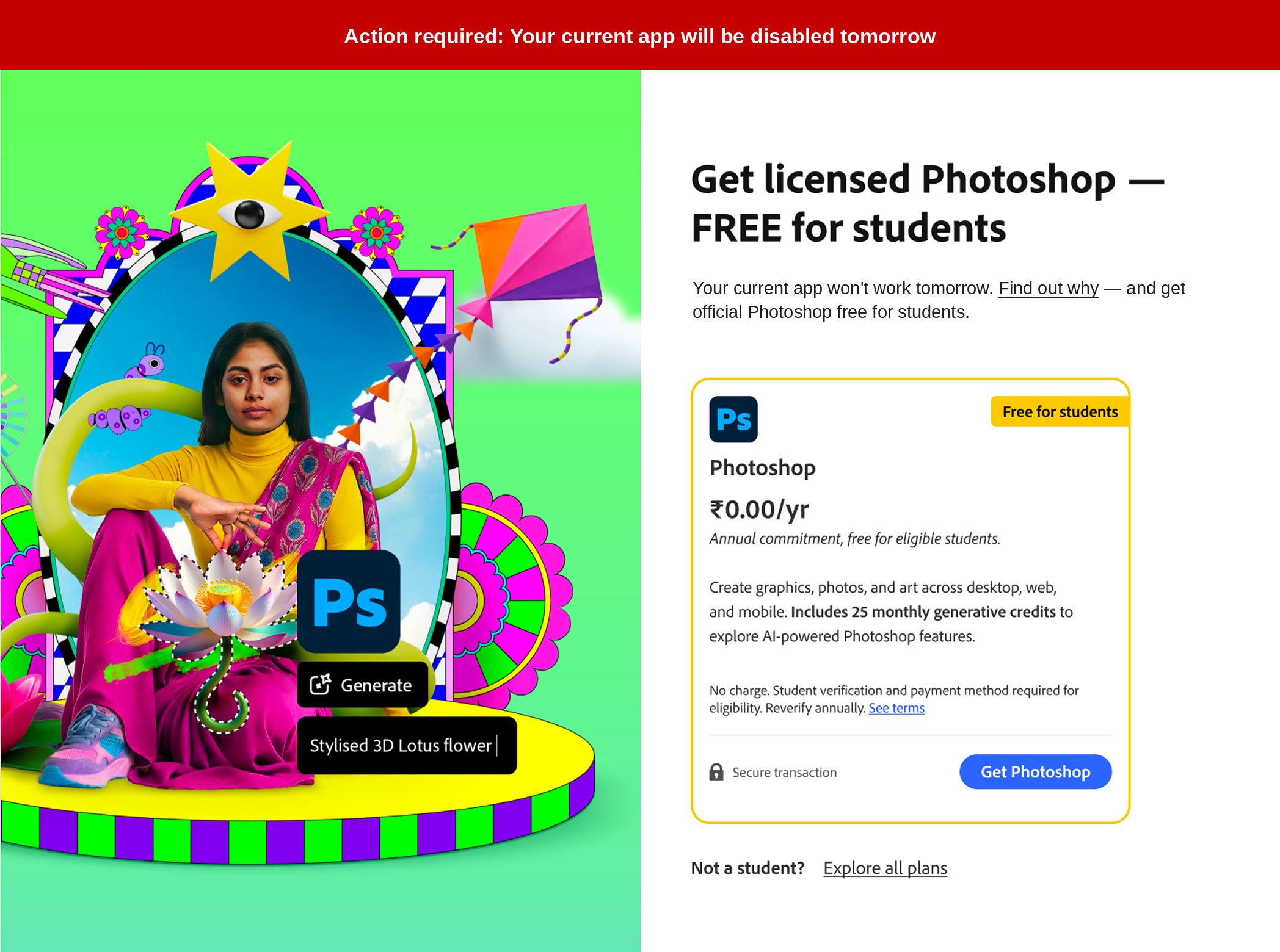
As the deadline approached, the messaging became more direct.
Earlier stages introduced the consequence alongside the free student offer. On the final day, the experience removed any ambiguity:
Your current app will stop working tomorrow.
The offer and call to action remained consistent, so users did not need to relearn the experience at the moment of highest urgency.
The structure stayed familiar. The deadline became impossible to miss.
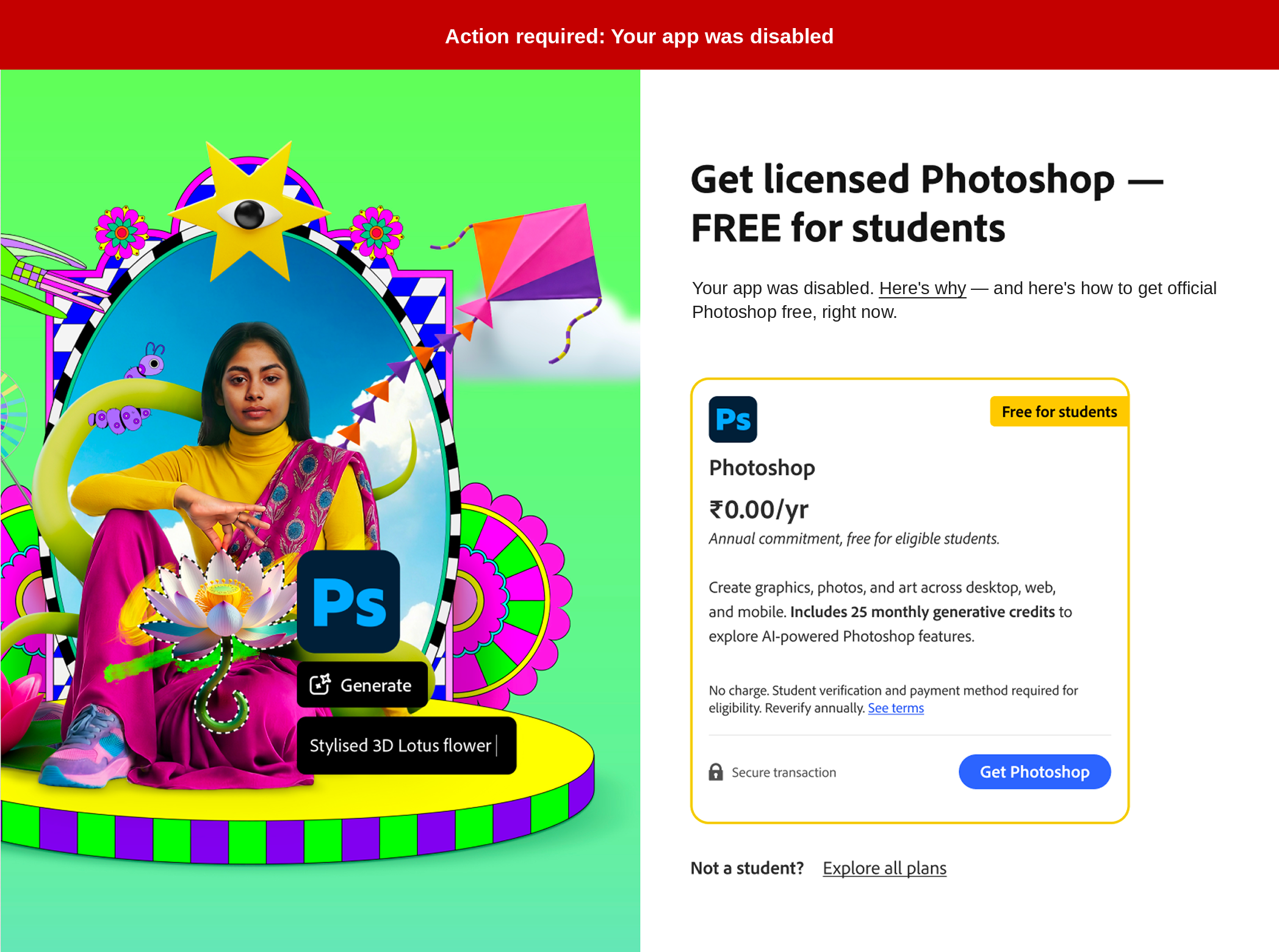
Disablement did not end the customer journey.
Once the app stopped working, the message shifted from warning to recovery:
You can still get licensed Photoshop—FREE for students.
The consequence had taken effect, but eligible students still received a clear way to restore access through genuine software.
The deadline changed. The path forward remained open.
1. Connect enforcement directly to a constructive alternative
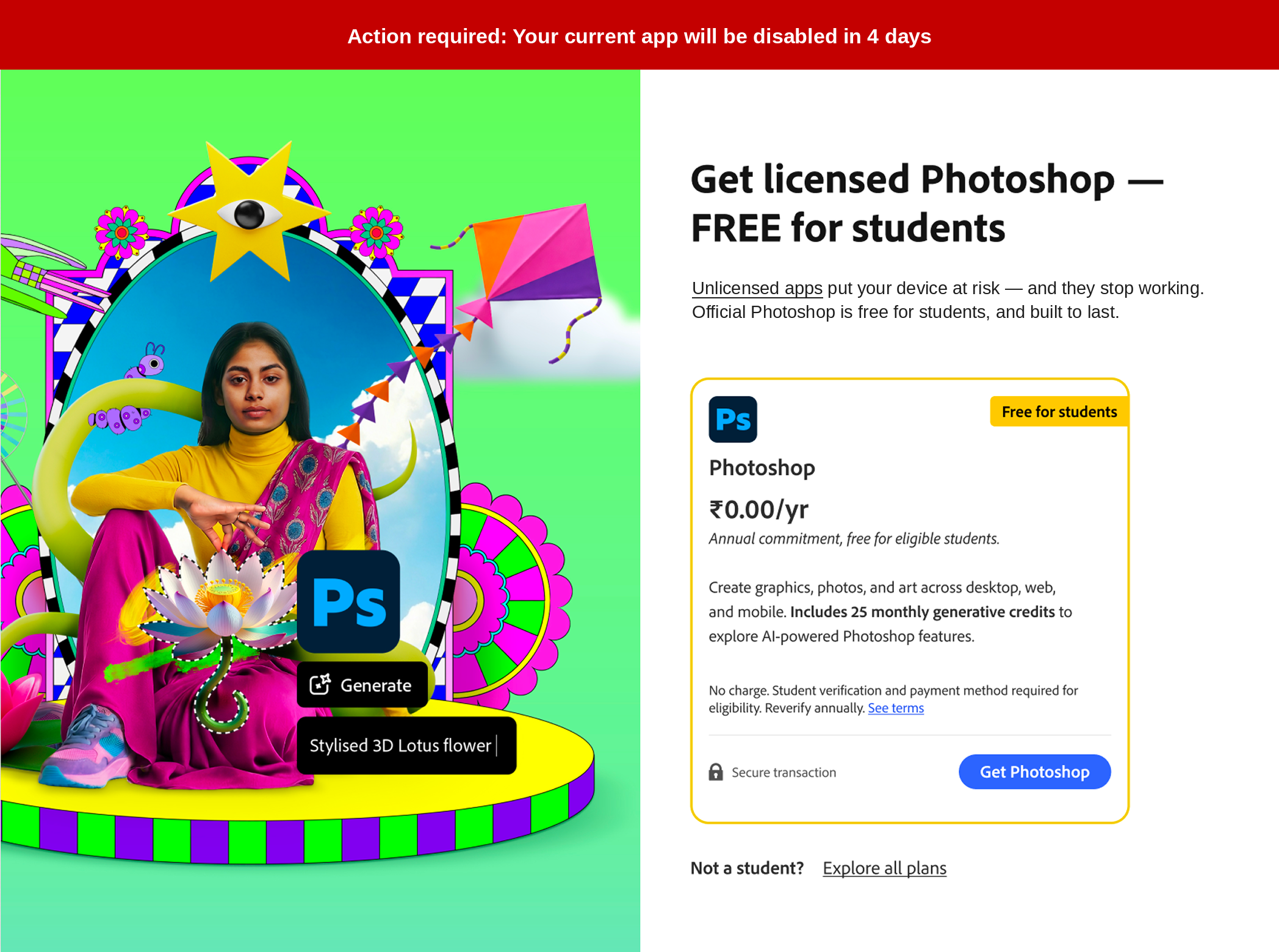
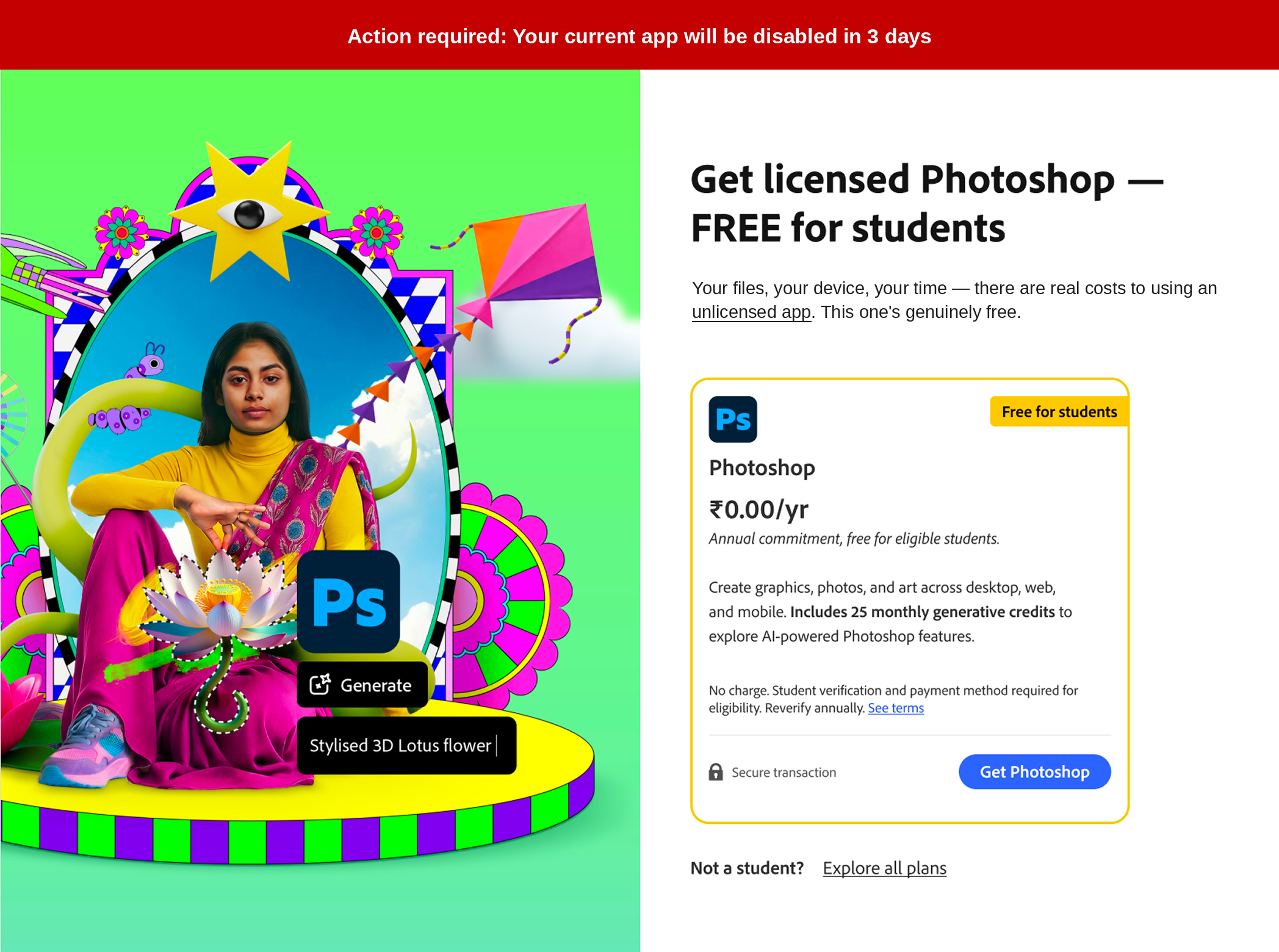
2. Repeat the offer while varying the reason to act
The free student offer remained consistent throughout the journey:
Get licensed Photoshop—FREE for students
But the supporting reason to act changed as the deadline approached.
Each stage emphasized a different motivation—from avoiding security and workflow risks to accessing current Photoshop and AI-powered creative tools.
One consistent offer. Multiple reasons to act.
This allowed the experience to build urgency without repeating the same message every day.
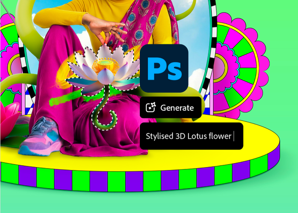
The campaign targeted students in India, where British English would have been the preferred English variant.
Adobe did not support British English as a distinct localization option for the product experience, so I followed the established protocol and wrote the interface copy in U.S. English. The accompanying visual had already been localized in British English, creating a minor inconsistency.
Advocate for the ideal. Document the constraint. Make the tradeoff deliberate.
The team accepted the mismatch so the pilot could move forward without introducing an unsupported localization requirement.
5. Continue helping users after disablement
Results
The journey generated a strong early response
The initial pilot reached a six-figure audience of eligible students in India over multiple weeks.
Within approximately five days, the campaign produced strong four-figure conversion volume, indicating that the combination of escalating urgency and a clear, zero-cost student offer was motivating users to move from non-genuine access to licensed Photoshop.
The experience succeeded by keeping three elements consistent throughout the countdown:
A clear consequence
A genuinely valuable alternative
One direct path to action
Because the pilot was still underway, the result was preliminary. Even so, the early performance represented a strong start and gave the team evidence that enforcement messaging could drive conversion without relying on fear or pressure alone.
Clear urgency created attention. A valuable solution gave users a reason to act.
Campaign outcomes reflect the work of the broader Adobe Genuine team. The messaging strategy, content architecture, and UX writing discussed here reflect my contribution.
What I learned
Urgency works better when the solution is inseparable from the consequence
The countdown made the deadline difficult to ignore, but the free student offer made the experience actionable. Neither element would have been as effective on its own.
The project reinforced several principles I now carry into other high-stakes product experiences:
Repetition does not require identical copy
The offer, CTA, and overall structure remained stable, while the supporting reason to act changed over time. That allowed the journey to feel familiar without becoming repetitive.
Escalation should increase clarity—not simply pressure
As the deadline approached, the language became more direct. The final-day message did not add more explanation; it removed ambiguity.
A firm consequence can still be customer-centered
The experience did not hide the fact that the app would stop working. But it also avoided treating disablement as a dead end. Every stage gave eligible students a clear path toward genuine software.
Constraints should be made explicit
The localization mismatch was not ideal, but documenting it allowed the team to distinguish between the preferred audience experience and what the existing product infrastructure could support.
Most importantly, the project showed that enforcement content does not need to abandon empathy or usefulness.
Even when the consequence is non-negotiable, the experience can remain clear, respectful, and focused on helping users move forward.