Introducing Venture X with curiosity—not pressure
How I shaped a premium-card launch email that beat campaign benchmarks by 6% for opens and 63% for click-through
Capital One’s Venture X launch email outperformed comparable upmarket credit-card campaigns. I wrote the featured sections that established the campaign’s aspirational tone, lowered conversion friction, integrated the limited-time offer, and invited customers to imagine where the card might take them.
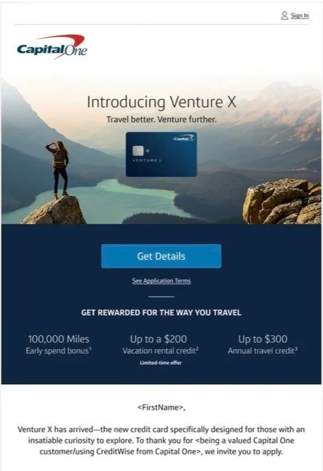
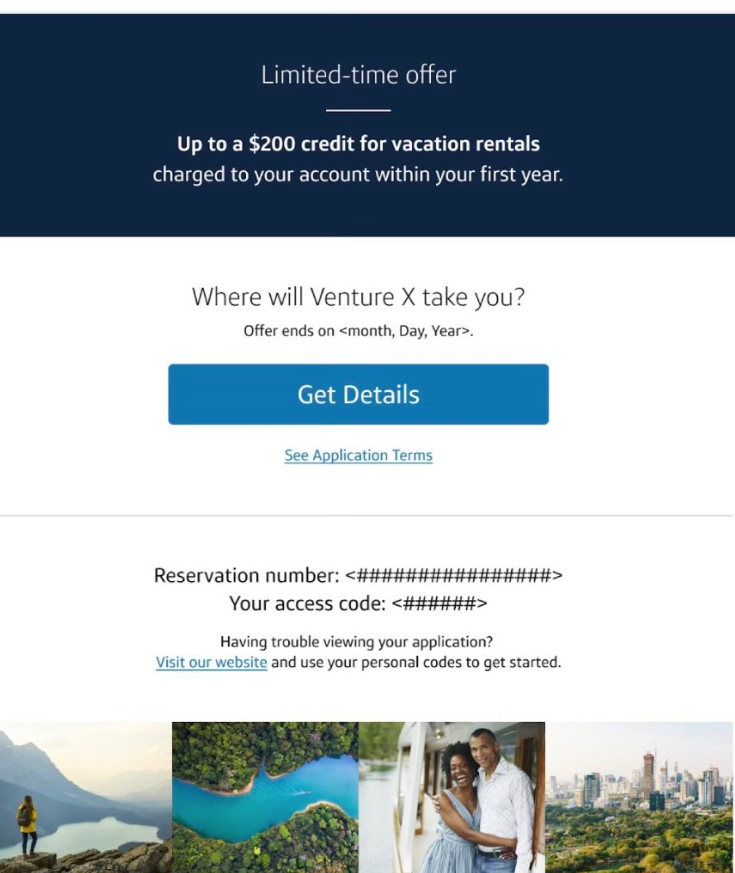
Project Overview
Role
Senior Copywriter, Brand Creative
My ownership
Opening and closing email sections, header and subheader, CTA strategy, benefits framing, limited-time-offer integration, closing question, and subject-line concepts
Partners
Art Direction and Design, Marketing, Product, Research, Legal, Compliance, and Analytics
Channels and scope
Cross-marketing email for qualified Capital One bank, CreditWise, and small-business customers, with related Capital One Mobile app notifications
+6%
Open rate vs. benchmark
+63%
Click-through rate vs. benchmark
84%
Approval rate for winning subject line
Invitation and curiosity outperformed bonus-led and application-led messaging.
Campaign outcomes reflect the broader cross-functional work. The copy strategy, subject-line concepts, and featured sections discussed here reflect my contribution.
The creative challenge
Make a premium travel card feel exciting and exclusive without making customers feel pushed into applying.
Venture X was entering a crowded premium travel-card market with a strong limited-time offer. The campaign needed to communicate meaningful value, but leading too aggressively with the bonus or an application CTA risked making the experience feel transactional.
Because the audience already had a relationship with Capital One, the stronger opportunity was to frame the launch as access—introducing the product clearly, creating curiosity, and giving customers room to explore before asking them to decide.
The strategy
Create interest before asking for commitment.
The email needed to introduce Venture X, communicate its value, and ultimately support applications. But asking customers to apply before giving them a reason to care would have undermined the premium experience.
I shaped the featured sections around a restrained progression: introduce the product, establish an aspirational idea, invite exploration, connect the benefits to the customer, integrate the promotional offer, and end with possibility.
This approach made the email feel more like an invitation into a premium travel experience than a direct-response promotion.
Impact at a glance
Key writing decisions
I shaped the email around a sequence of low-friction decisions that moved customers from product awareness to curiosity, exploration, and consideration.
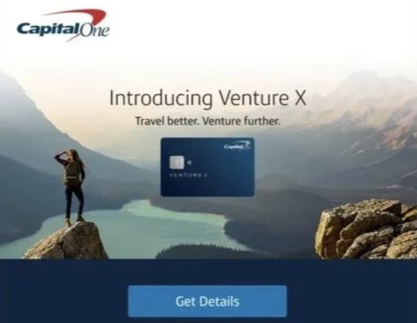
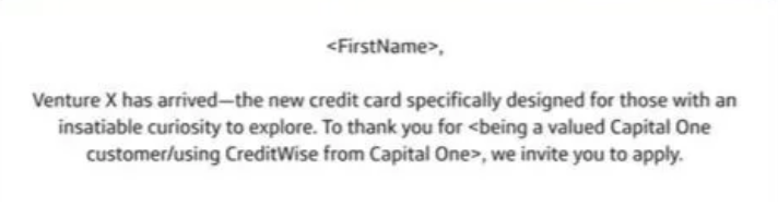
Introducing Venture X
The opening immediately established that this was a new Capital One product. The language was direct and informative, giving customers the context they needed without beginning with an offer or application request.
Travel better. Venture further.
The supporting line combined practical value with aspiration. “Travel better” suggested a tangible improvement to the customer’s experience, while “Venture further” invited them to imagine what the card could make possible.
Together, the lines introduced both the product and the larger promise behind it.
Get Details
Rather than asking customers to apply immediately, I used “Get Details” to create a lower-friction first step.
A premium financial product requires consideration. The CTA gave customers room to understand the annual fee, rewards, benefits, and offer terms while still moving interested customers deeper into the experience.
2. Connect the benefits to the way customers already travel
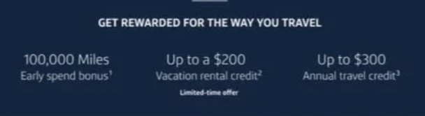
Get rewarded for the way you travel.
Premium-card messaging can quickly become a list of points, credits, and features. I wanted the benefits section to connect those features to something more personal: the customer’s existing travel habits and ambitions.
The line positioned Venture X as a way to receive more value from travel customers already wanted to do. It did not ask them to adopt a different lifestyle; it made the card feel relevant to the way they already saw themselves.
Pair aspiration with practical value
The supporting benefits provided scannable, tangible proof of the card’s value: 100,000 bonus miles, a vacation-rental credit, and an annual travel credit.
Presenting these benefits beneath a customer-centered idea allowed the campaign to balance aspiration with specific, useful information.
3. Support the promotional offer without letting it take over
Invitation-led
Subject line
[First name], Venture X is here—and you’re invited
Results
45% open rate
1.08% click-through rate
84% approval rate
The invitation-led version created a sense of access without leading with the application or bonus.
Integrate the offer into the larger story
The 100,000-mile offer was an important acquisition incentive, but it was also temporary. Building the entire campaign around it would have made the message feel more promotional and less durable.
I positioned the offer as supporting evidence rather than the sole creative idea. Customers could understand the immediate value while the broader narrative remained focused on premium travel, rewards, and possibility.
Design for a campaign beyond launch
The offer was written as a modular section that could be removed after the promotional period without disrupting the rest of the email.
This made the creative more resilient and allowed the campaign to continue without rebuilding its central narrative.
4. End with possibility rather than another hard sell
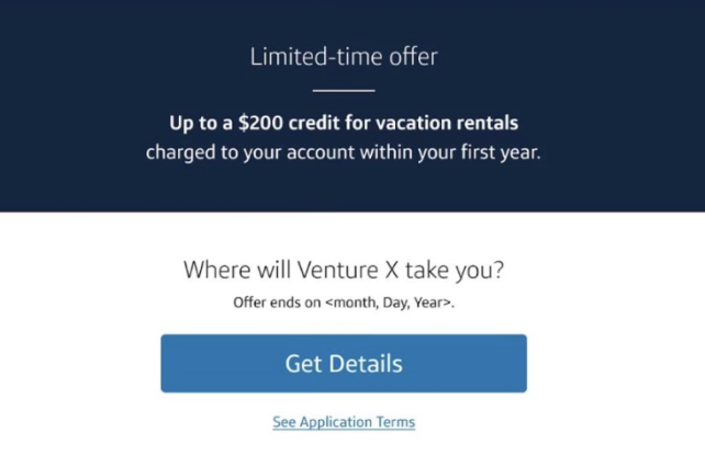
Where will Venture X take you?
The closing question returned the message to the customer’s imagination.
Rather than repeating the bonus or ending with another forceful application instruction, it invited customers to picture the experiences the card might enable. The question reinforced the travel narrative while leaving the email on an open, forward-looking note.
Maintain a consistent conversion path
Repeating “Get Details” preserved the low-pressure approach established at the beginning of the email.
From the first CTA to the last, customers were invited to explore before committing. This consistency helped the experience feel considered and confident rather than increasingly aggressive as the email progressed.
Testing invitation v. promotion
The subject-line test compared three approaches: a selective invitation, a prominent bonus, and an explicit application message.
Bonus-led
Subject line
[First name], here’s your chance to earn 100,000 bonus miles
Results
45% open rate
1.01% click-through rate
76% approval rate
The bonus-led version matched the winning open rate, but fewer recipients clicked and its approval rate was eight percentage points lower.
Application-led
Subject line
[First name], you’re invited to apply for Venture X, with a chance to earn 100,000 bonus miles
Results
44% open rate
0.96% click-through rate
76% approval rate
The longest and most application-focused version performed worst for both opens and clicks.
The test reinforced the strategy used throughout the email: this audience did not need a harder sell. A confident invitation generated stronger engagement and attracted a more qualified response than leading with a large promotional offer or an explicit application message.
Creative principle
For a sophisticated premium audience, exclusivity and intrigue can be more persuasive than shouting the incentive.
Results
Content and customer results
The email created a consistent narrative across its most important moments.
“Introducing Venture X” established clear new-product context. “Travel better. Venture further.” combined practical value with aspiration. “Get Details” encouraged exploration without implying immediate commitment. “Get rewarded for the way you travel” connected the benefits to the customer’s existing behavior. “Where will Venture X take you?” ended with possibility rather than another hard sell.
Subject-line testing validated the same restrained approach. The invitation-led version produced a 45% open rate, a 1.08% click-through rate, and an 84% approval rate.
It matched the open rate of the bonus-led alternative while producing a higher click-through rate and an approval rate eight percentage points higher.
Campaign and business results
The overall email campaign exceeded the benchmarks for comparable upmarket credit-card cross-marketing campaigns by 6% for open rate and 63% for click-through rate.
The test also provided a clear insight for future premium-card messaging: customers were more responsive to language that made them feel selectively invited than to language centered on the bonus or application itself.
The winning line did not hide the product value. It simply allowed curiosity and exclusivity to create the first point of engagement.
——-
These results reflect the work of the full campaign team. My contribution was writing and shaping the email’s opening and closing sections, CTA strategy, benefits framing, promotional integration, closing question, and subject-line concepts.
What I learned
Premium messaging often becomes stronger when it does less.
The winning subject line—“Venture X is here—and you’re invited”—was shorter, subtler, and less promotional than the alternatives. It did not lead with 100,000 miles or instruct the customer to apply. Yet it produced the strongest click-through and approval performance.
That result reinforced the principle I had applied throughout the email: create interest before asking for commitment.
The project also demonstrated the importance of measuring more than initial attention. Open rates alone would have made the invitation-led and bonus-led subject lines appear equivalent. Click-through and approval performance revealed that the invitation-led message produced the stronger overall customer response.
Finally, designing the email so the temporary offer could be removed without disrupting the narrative made the work more resilient beyond the initial launch window.